Remedy Brand
This style guide delivers delightful visual graphic elements to the remedy Brand. It will represent the concept of repair through the first product, which is the ‘Remedy Matcha Green Tea, and a concept of repair through the second product, which is the ‘Remedy Teapot’.
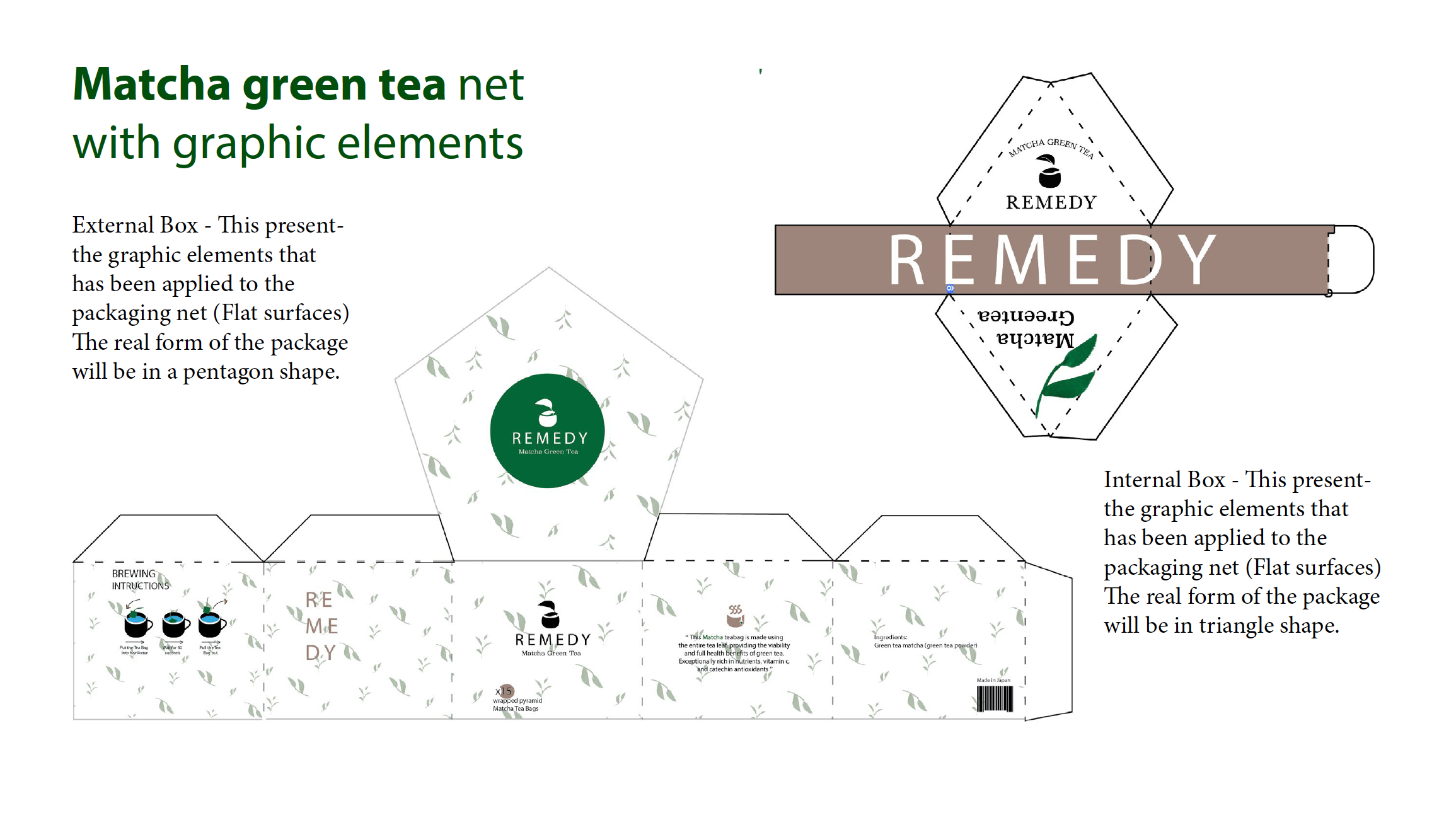
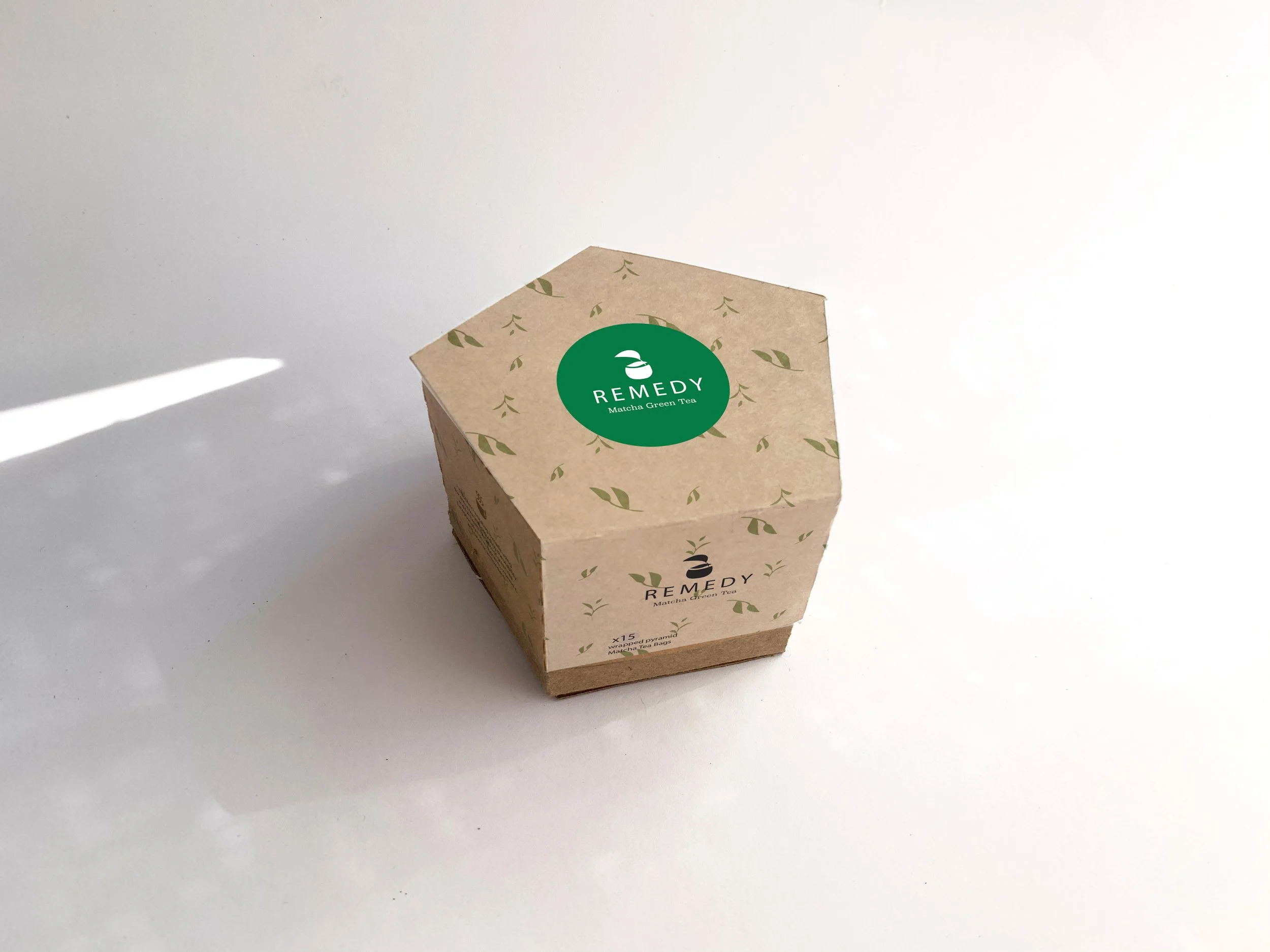
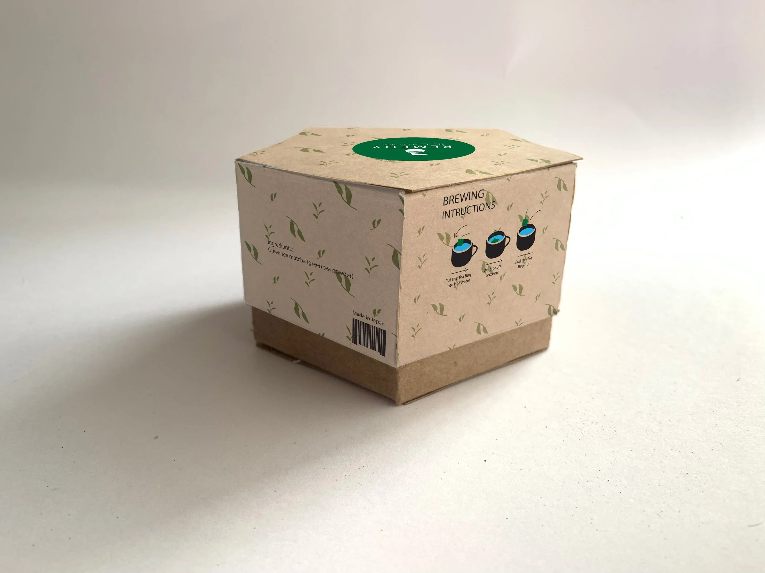
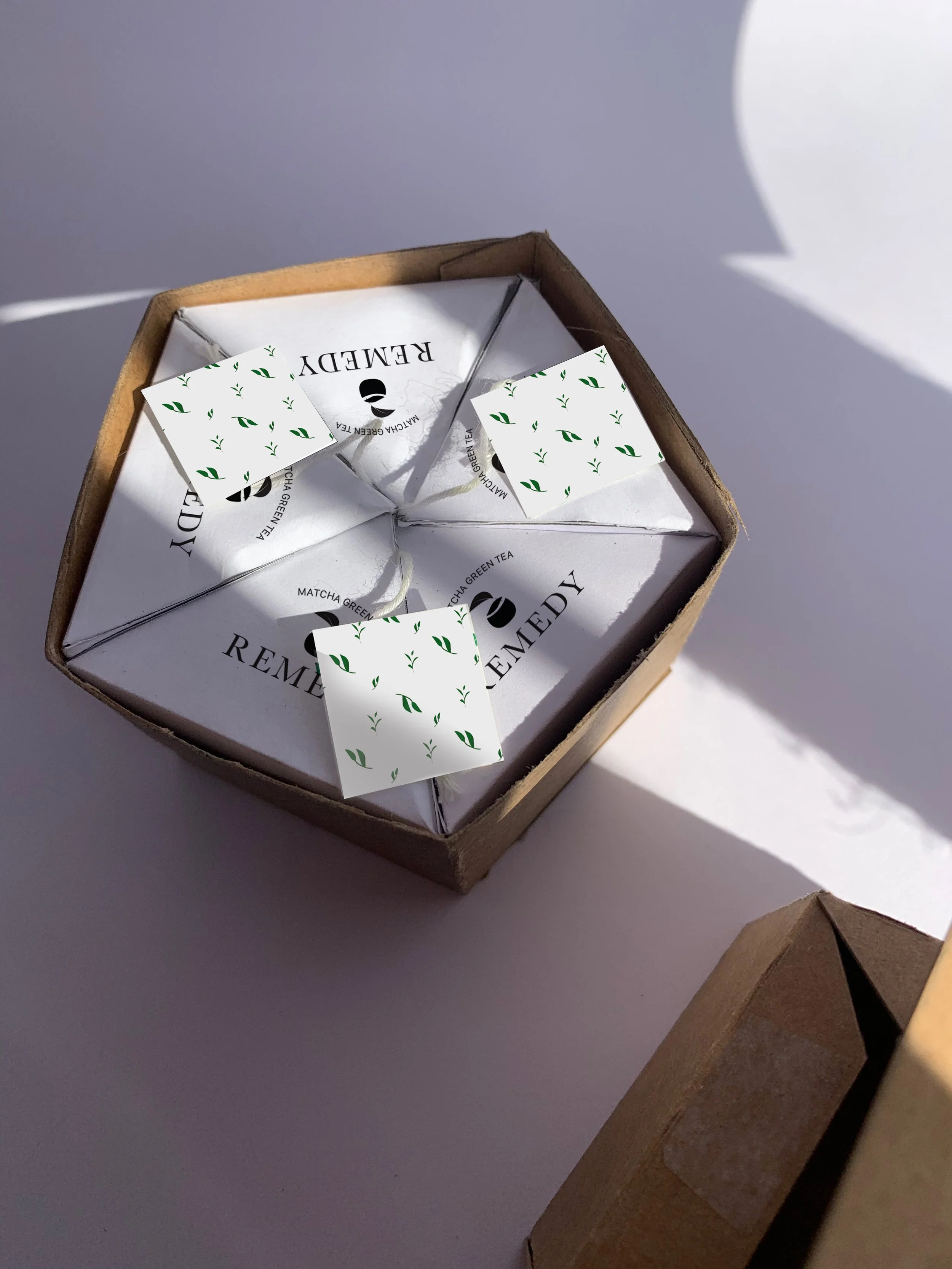
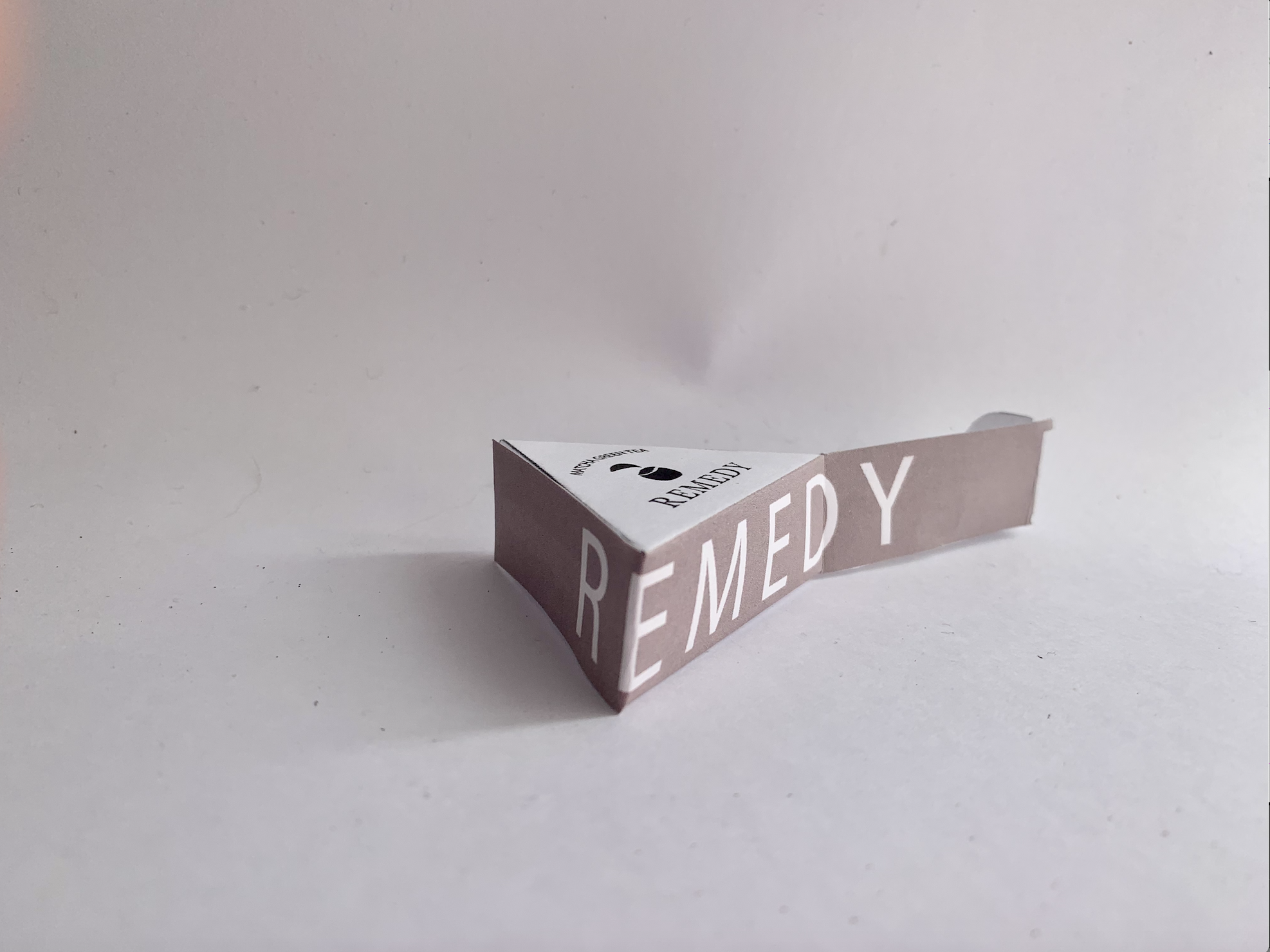
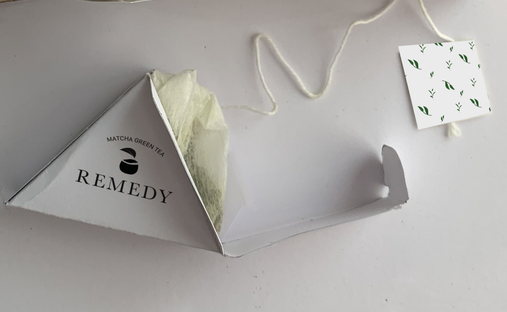
The Remedy Matcha green tea packaging design will provide 2 different packages including The external package, which is the package that includes 15 tea bags inside, and the internal package, which will cover the tea bag individually. The packaging concept is to fit 15 individual tea bags inside, and in a compatible form. This is because it is convenient when customers buy it. Customers can buy a single product but get the amount that will last for a long period. And with its size that is in a compatible size, customers will Internal package is in a triangle shape, which has been measured properly to fit in the external package, which is a pentagon shape. The package has a function that is efficient, it has two parts separated, One is the cover and one is the base. This is for the efficient use as it can be opened easily.For the material, the Matcha green tea package is made with thick paper (600 grams). The paper has a texture and colour similar to cardboard. Brown communicates a sense of organic, which is suited with the Remedy Matcha green tea as it’s an organic green tea.
The colour palette includes dark green, light brown, black, and white. Green is a natural colour, which can communicate the sense of leaf perfectly. Black is a strong colour, this colour is used for the text displaying on the package as it’s readable. White is use for the background colour Repair Ritual
Design disciplines: Packaging Design, Brand Identity

Client
Student Project
Year
2021
Packaging
Die line
It all begins with an idea. Maybe you want to launch a business. Maybe you want to turn a hobby into something more.

Matcha Green Tea
Packing Design Mock-up (Exterior)
Matcha Green Tea
Packing Design Mock-up(Interior)
Teapot
Packing Design Mock-up
